The true size of countries is far different than what you know

All of us must be familiar with the map that’s coloured in light blue (i.e the Mercator Projection) in which the north-western and northern countries look very big in comparison to other countries but not the dark blue map, which represents the true size of countries with respect to each other.
Basically, all the countries near the equator are larger than they appear to be, but why so? Before learning the reason, let’s see a few comparisons to understand the level of distortion in these two maps.
Here’s how the size of five countries that are near the Equator change when they are positioned in different places around the map that we normally use.
· India
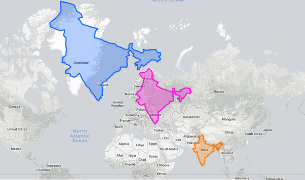
Actual size (Orange)- 3.287 Million Sq. Km,
Placed on Europe(Pink),
Placed on Greenland(Blue), size of Greenland- 2.166 Million Sq. Km.
· Indonesia
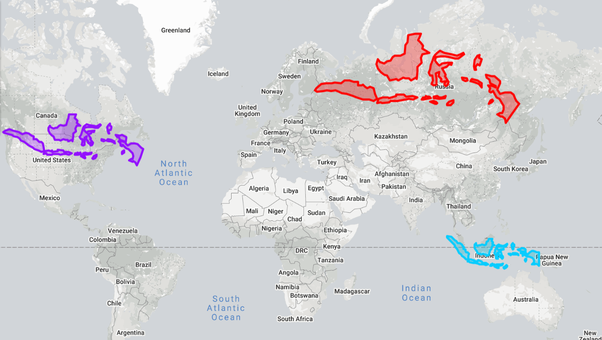
Actual size(Light Blue)- 1.905 Million Sq. Km,
Placed on North America (Purple),
Placed on Russia (Reddish Orange), size of Russia — 17.098 Million Sq. Km.
· Brazil

Actual size(Reddish Orange) — 8.516 Million Sq. Km,
Placed on Europe(Magenta),
Placed on Canada(Light Blue), size of Canada — 9.985 Million Sq. Km.
· Democratic Republic of Congo

Actual Size(Blue) — 2.345 Million Sq. Km,
Placed near Alaska(Green), size of Alaska — 1.718 Million Sq. Km,
Placed on Greenland(Yellow), size of Greenland — 2.166 Million Sq. Km.
· Australia

Actual size (Blue) — 7.692 Million Sq. Km,
Placed on Europe(Orange),
Placed on Canada(Magenta), size of Canada — 9.985 Million Sq. Km.
All thanks to the most popular map, i.e Mercator projection map, most of us don’t know the actual size of countries relative to each other.
In short, it distorts the size of countries as the latitude increases from the Equator to the Poles, therefore making the countries near Poles appear relatively bigger than the countries near the Equator.

The Mercator projection was made to help in navigation, it preserved angular relations, i.e a straight line connecting any two points will travel in the same direction a compass would show, this type of route is called a Rhumb line.
It helps ships to sail in a constant compass direction over long distances reducing difficult and error-prone course corrections while preserving the shape and size within small areas but the projection also distorts the size of countries massively.
Few other comparisons,
· Africa is actually 15 times and South America is 8 times larger than Greenland
· Brazil is almost as large as Canada and the USA
· Alaska is a bit smaller than Libya
· Side to side Indonesia spans almost 3/4th of Russia
· China, Brazil, Australia each can almost cover the entirety of Europe
You can check this website if you wish to compare the sizes of other countries.
I hope this article was informative and you learnt something new.
References:
Youtube videos: Real Life Lore, General Knowledge
